A tablet-first PowerApps application built for a medical robotics company to help sales teams analyze and present Total Cost of Ownership (TCO) data. The tool replaced outdated Excel workflows with a centralized, user-friendly, and interactive interface, integrated with Power BI dashboards.
The Problem
Sales reps relied on complex Excel sheets to analyze TCO data, leading to:
Manual errors in calculations
No centralized platform for data
Time-consuming report generation
Poor usability on mobile/tablet devices
This created friction during client meetings and slowed down sales workflows.
Goals
Replace Excel-based tools with a clean, responsive application
Improve data readability and visual analysis using Power BI
Create a tablet-friendly experience with smooth touch navigation
Enable sales reps to generate insights quickly with fewer manual steps
Users
The primary users of the application were Sales Representatives and their Managers at a medical robotics company. They needed a quick, accurate, and tablet-friendly way to present cost breakdowns during hospital procurement discussions.
Secondary stakeholders, like doctors, contributed cost-related inputs through SharePoint but did not directly interact with the application.
Design Process
Understand
Reviewed Excel workflows, business logic, and functional requirements to understand pain points and key metrics.
Design
Created high-fidelity UI in Figma, optimizing layout for tablets and PowerApps constraints. Focused on hierarchy and readability.
Collaborate
Worked closely with Power Platform and Power BI developers to align designs with technical feasibility and embed dashboards effectively.
Validate
Refined the UI based on internal feedback and ensured the final app supported touch interactions and data clarity on all screens.
Key Features/Screen
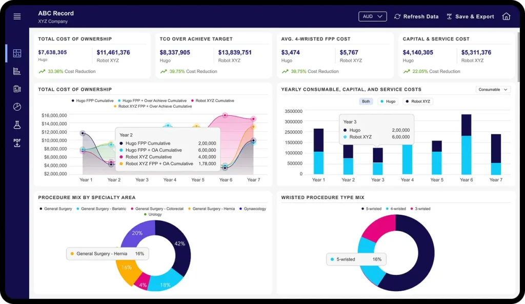
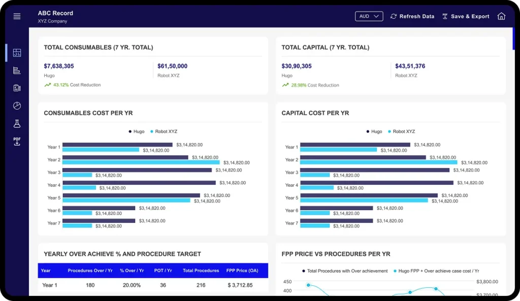
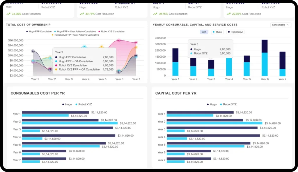
Dashboard with KPI Cards
Highlights key metrics like upfront cost, operational cost, and ROI at a glance.
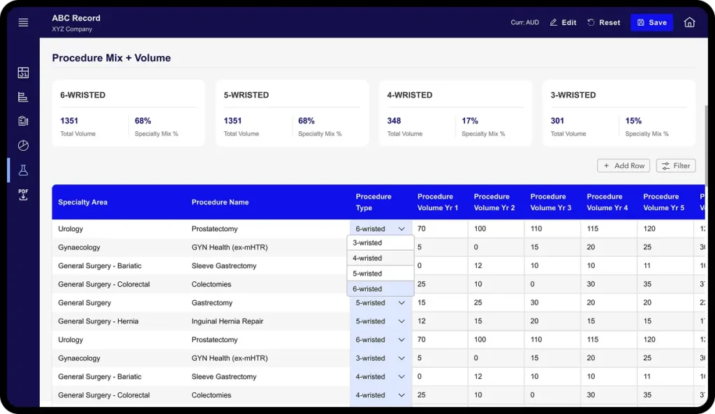
Financial Input Screens
Clean, structured inputs that feed into cost analysis calculations.
Power BI Dashboard Embed
Interactive graphs and tables for deep cost insights.
Scenario Comparison
Allows users to quickly compare cost options between different medical devices.
Outcome
Reduced manual effort and saved time for sales reps
Enabled tablet-friendly cost presentations during client meetings
Improved data accuracy with structured inputs
Positive feedback from internal stakeholders on usability and visual clarity
Challenges & Takeaway
⚙️ Challenges
Designing within the strict layout limitations of PowerApps
Embedding and aligning Power BI dashboards within a limited frame
Maintaining readability across multiple data-heavy screens
💡 Key Takeaways
Simplicity and clarity are critical in enterprise tools
Working within platform constraints demands creative prioritization
Collaborating closely with devs early improves handoff and success